
Introduction
A space can have beautiful furniture, premium materials and carefully planned architecture, yet still fail to create the right feeling.
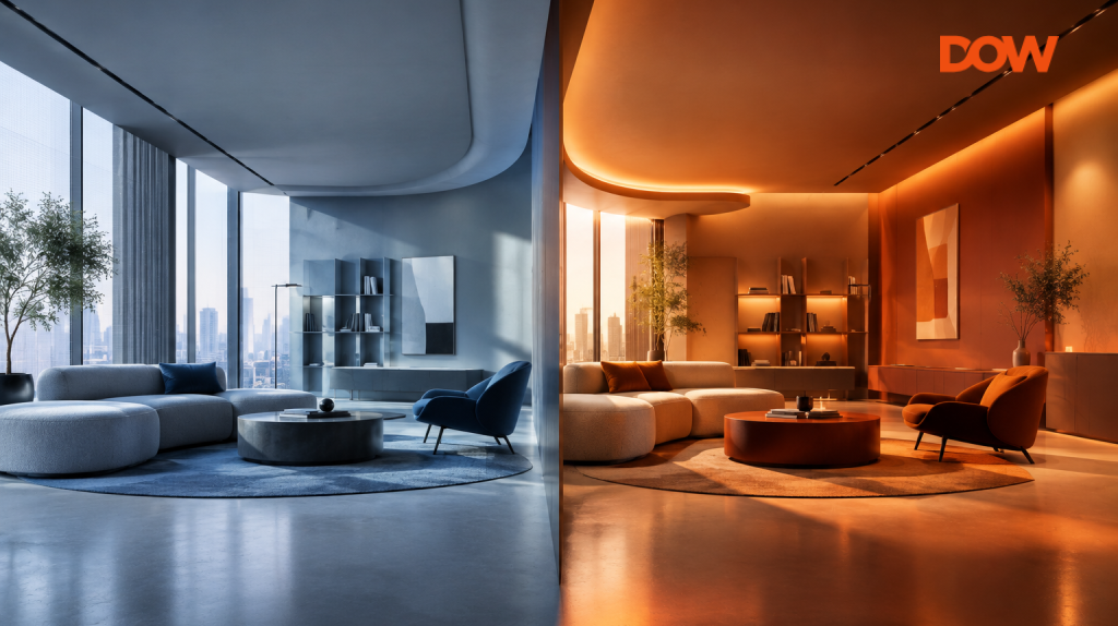
The difference often comes down to two elements that are easy to underestimate lighting and colour. They can make an environment feel warm or clinical, lively or calm, intimate or open.
Lighting and color are consequently more than just finishing touches in contemporary interior design. They are instruments for influencing how individuals see an area.
Designing the Feeling, Not Just the Look
Traditional interior design often focuses on how a space looks and functions. Experiential design goes further by considering how people should feel, behave, and interact within that space.
Every environment has a different purpose. A corporate office may be designed to encourage focus, energy, and collaboration. A hospitality space may aim to create a sense of warmth and relaxation.
This is where lighting and colour become powerful design tools. They can influence the mood of a space from the moment someone enters, often before they consciously notice individual design elements.
When these elements come together thoughtfully, a space does more than look good; it creates an experience that supports how people are meant to feel and engage within it.
Lighting Creates the Atmosphere
Lighting is among the first things people notice when they enter a space.
Natural daylight can make an environment feel open, fresh, and connected to the outdoors. Warm artificial light tends to create a relaxed, welcoming mood, while brighter, more focused lighting can make a space feel active and functional.
But lighting is about more than brightness.
Direction, intensity, colour temperature, and contrast all shape the experience.
A focused beam can pull attention towards a product or architectural feature. Soft, even light can create a calmer setting. Dynamic lighting can bring movement and energy to an event or brand experience.
That makes lighting a powerful storytelling tool.
Lighting Can Guide People
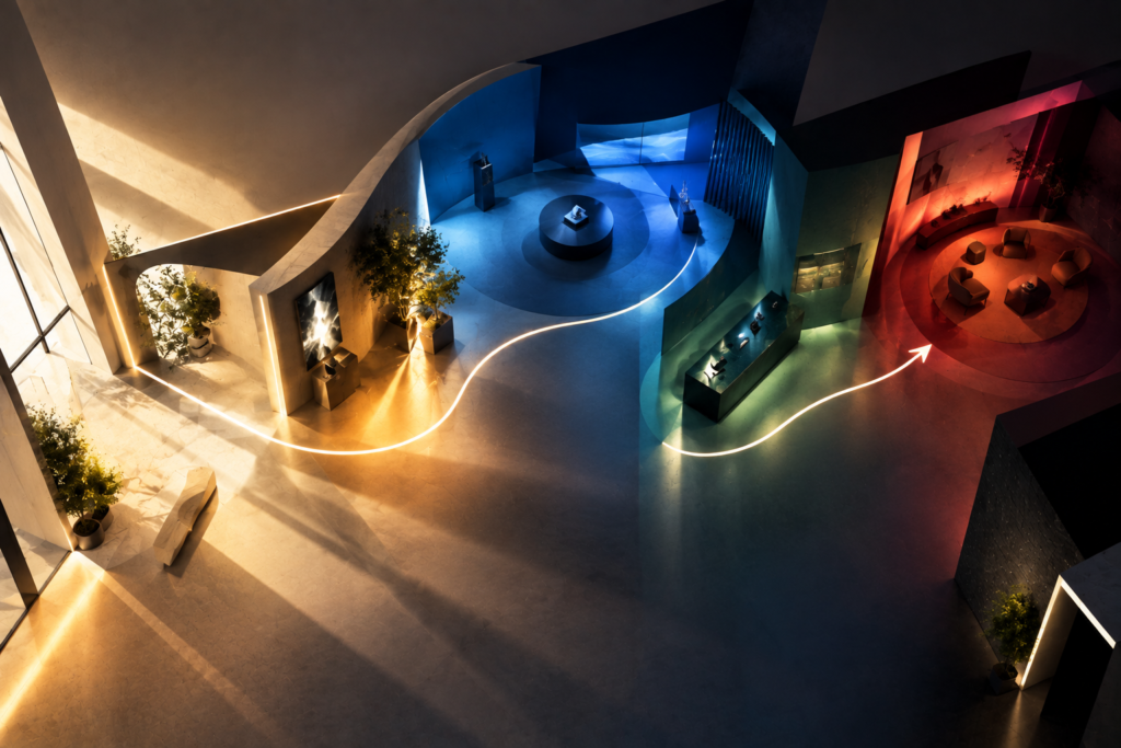
An area’s ability to navigate can also be impacted by effective illumination.
A brighter area can naturally attract attention. A highlighted entrance can make the destination obvious. Lighting along a pathway can subtly guide visitors from one zone to another.
In an experience centre, for example, lighting can create a visual sequence:
Entrance → Discovery → Interaction → Product → Conversation
Rather than relying entirely on signage, the environment itself shows people where to go.
This is especially useful in large spaces, where visitors might otherwise feel overwhelmed.
Colour Creates Identity
While lighting plays a major role in shaping the ambience of a space, colour helps define its identity and character. Color can instantly convey character.
A limited color scheme can evoke a sense of elegance or sophistication. Vibrant, opposing colors can generate dynamism and prominence. Gentler hues can foster a more calming environment.
For branded environments, colour also provides continuity.
A company’s brand palette can be translated into walls, furniture, graphics, lighting accents and digital content. However, effective experiential design does not mean covering every surface in brand colours.
Sometimes, using a brand colour selectively creates a stronger effect.
Colour Can Define Zones
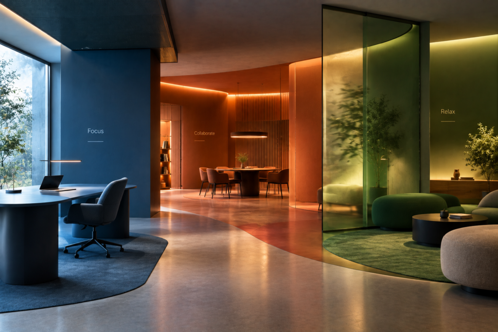
Color can additionally assist in arranging a space.
Envision a spacious office featuring various zones for teamwork, concentration, and leisure. Rather than depending solely on physical barriers, variations in color, texture, and illumination can assist in visually differentiating each area.
The same concept can be applied in retail shops, hospitality venues, experience centers, and events.
A specific colour group may represent one type of product, whereas another denotes a different sector. This enhances the clarity of the environment without overloading it with signs.
The Relationship Between Colour and Light
A key consideration is that color does not exist without the presence of light.
The identical wall shade can appear entirely distinct in daylight, warm illumination, or cool illumination.
A material that appears neutral in one environment may appear warmer or cooler under another lighting condition. This is why colour selection should be considered alongside the lighting strategy.
Designers need to think about how surfaces will look throughout the day and under different artificial lighting conditions.
Creating Contrast and Focus
Light and color gain significant strength when combined to produce contrast.
A dark backdrop can highlight a well-lit element. A neutral setting can enhance the visibility of a brand color. An intentional lighting setup can focus attention on a specific architectural or product feature.
This approach can be especially effective in experiential spaces where visitors need to understand what matters first. Instead of making everything visually loud, designers can create moments of emphasis.
Beyond Aesthetics
Lighting and colour are often discussed as aesthetic choices, but their role goes much deeper.
They can influence orientation, attention, mood, brand recognition and the way people interact with a space.
A well-lit pathway can make navigation easier. A carefully chosen colour can distinguish one zone from another. A controlled lighting environment can focus attention on a product. A consistent colour language can strengthen brand identity.
These are functional outcomes not just visual ones.
Designing How People Feel
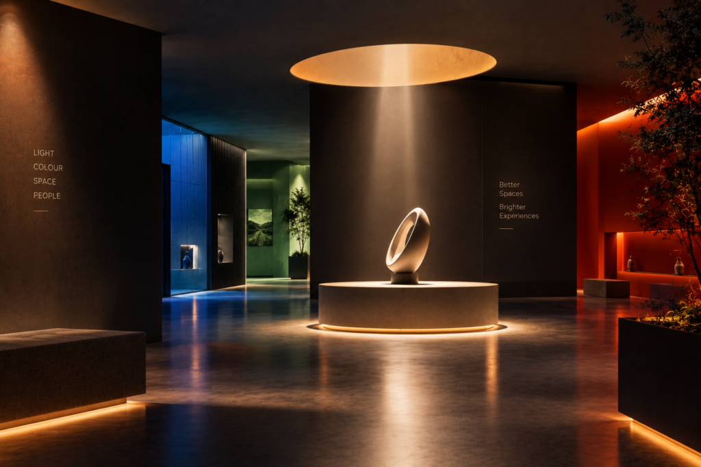
A successful space does not simply ask people to look at something.
It creates an atmosphere around them.
Lighting can set the mood. Colour can establish identity. Together, they can guide attention, define spaces and influence how people experience their surroundings.
The most effective experiential interiors therefore do not treat lighting and colour as decorative decisions made at the end of a project.
They consider them from the beginning.
Because ultimately, great spatial design is not only about creating something people can see.
It is about creating an environment people can feel.